A Simple, Modern Apartment in Moscow
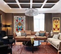
Beautiful design never means the same thing to two people. While one person may covet the simplicity of Scandinavian styles, another may long for ornate chandeliers and Louis XIV chairs. The design featured here, from visualizer Anastasia Skoblik and designer Julia Lapteva is not, perhaps, most people’s conception of beautiful. With neutral colors and very few flourishes, this design is practical at its core. Still, the simplicity and modernity of the design are beautiful in their own way. This apartment is like a canvas, where any occupant could easily put his or her touch on top of the existing design for a strong shot of personality.
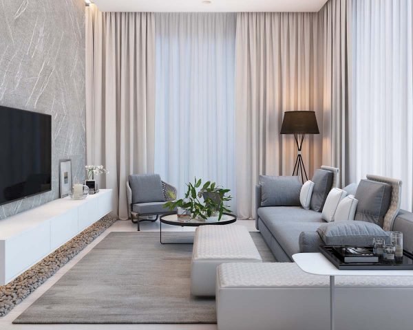
This visualization is for the residential apartment complex called Egdom, located in Moscow.
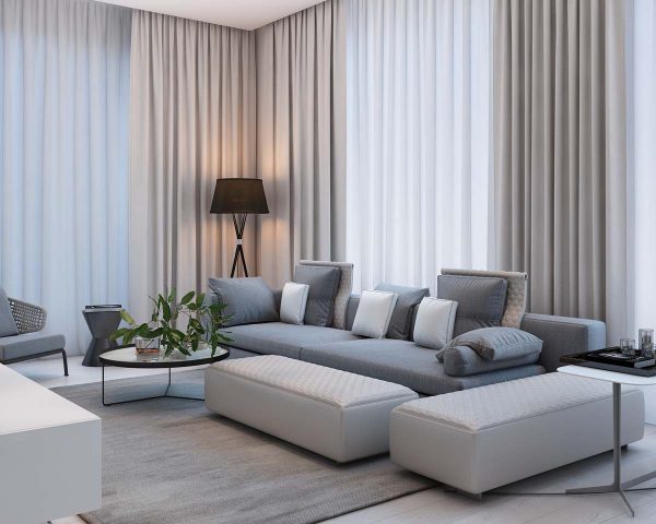
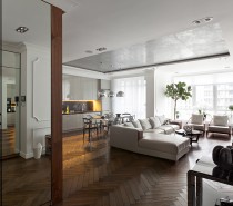
The use of unique floor lamps adds a warm element to the main living space that is mainly done in cool, neutral colors.
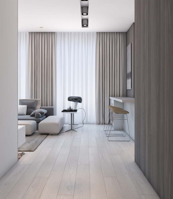
The apartment is quite spacious, meaning there is a lot of room for seating in every area of the home.
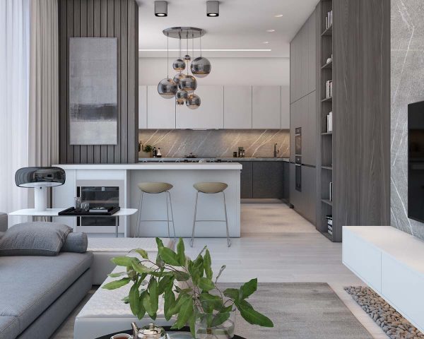
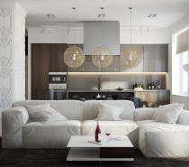
For example, kitchen bar stools are simple but ideal for enjoying a quick breakfast at the bar.
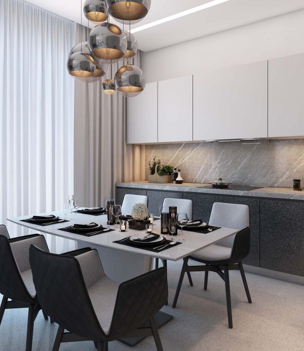
In the dining room, dining room pendants dangle in a modern cluster of the dining table, which has plenty of room for 6.
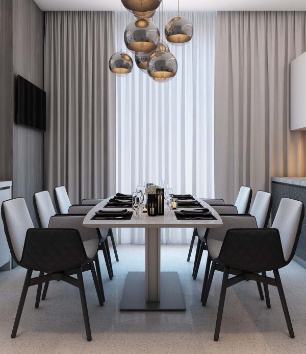
The modern dining chairs have a unique folded design that adds both comfort and style.
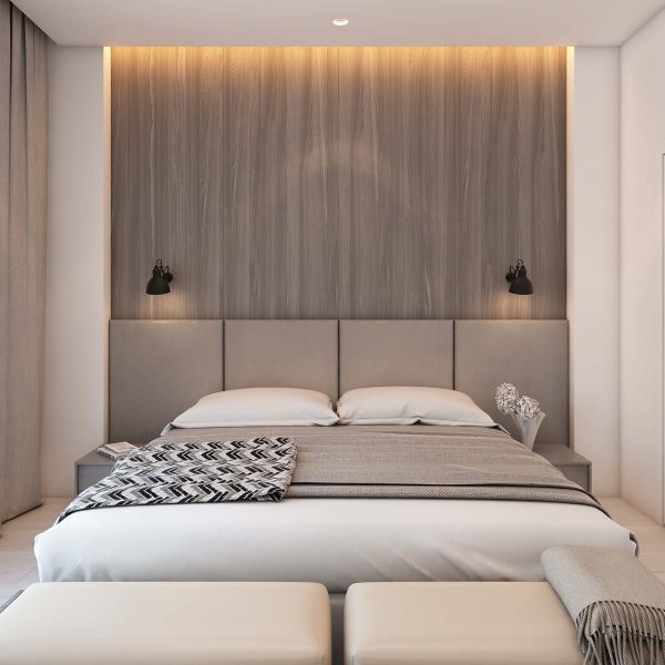
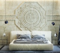
Moving into the bedroom, the neutral color palette clearly carries through.
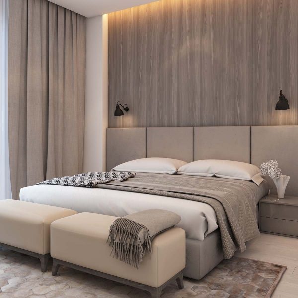
From bedding to rugs to the natural wood accent wall behind the headboard, this is a room that does not believe in color.
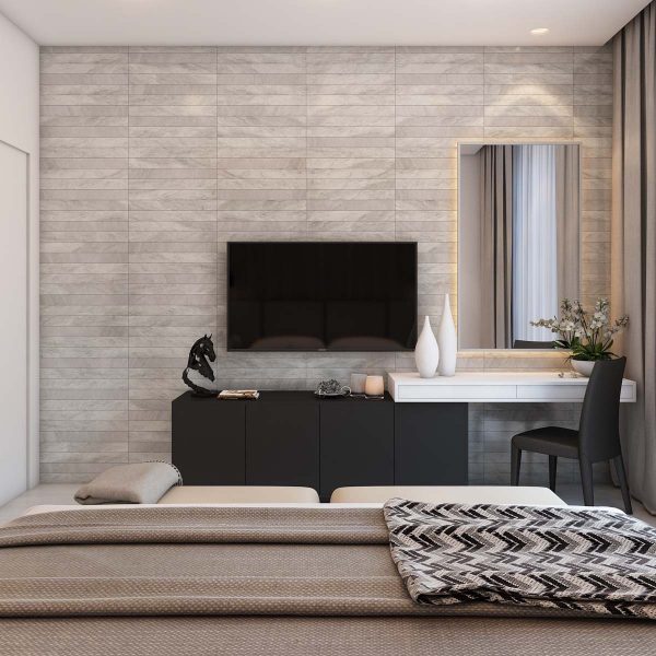
The room does, however, have unique vases that add a bit of personality.
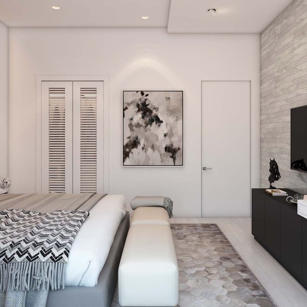
Slatted doors across the closet are an interesting look and helps with ventilation.
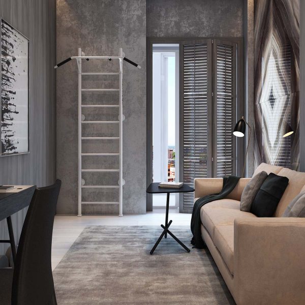
The slat design is also in use in the den, where anything from a relaxing nap on the sofa to a full workout session is fair game.
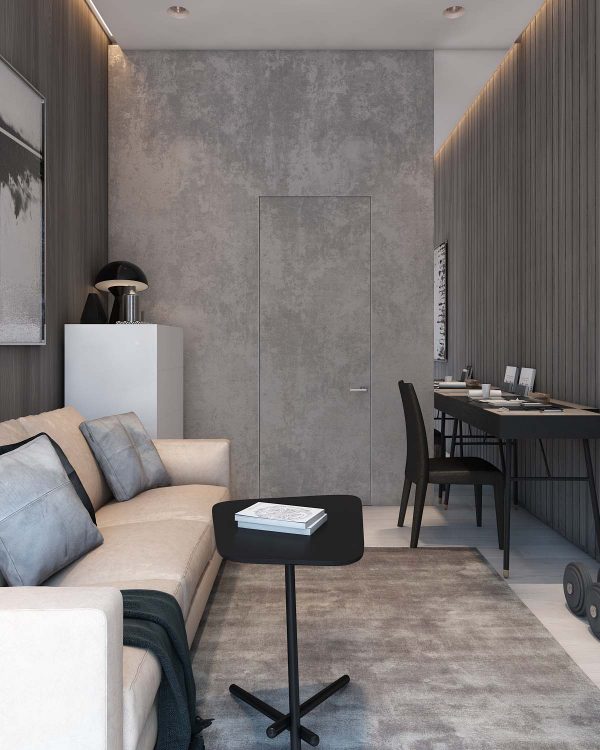
The narrow den also includes a modern leather sofa and a small work desk.
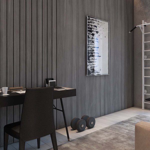
Dumbbells and a pullup station are a strong foundation for a home workout regimen.
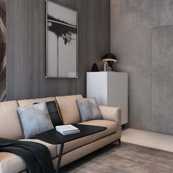
The warm beige of the sofa makes it look supple and inviting.
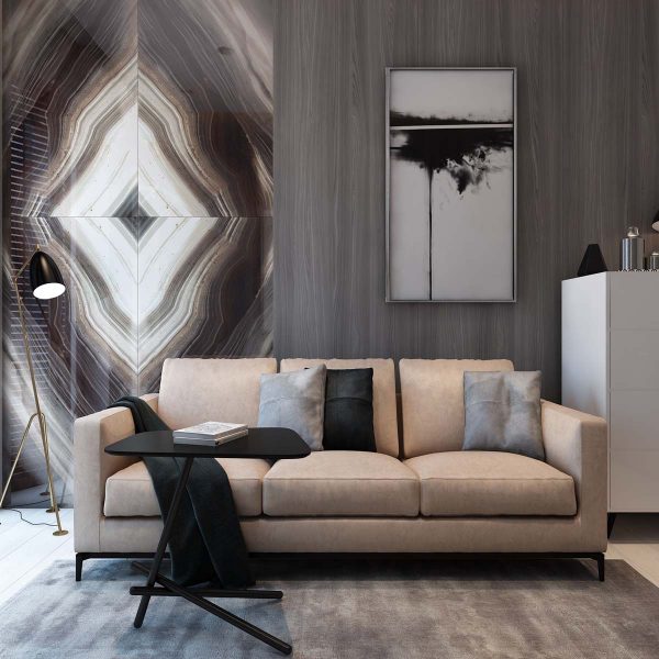
Unique floor lamps like the AJ Floor Lamp lend a practical but sophisticated air to this multipurpose room.
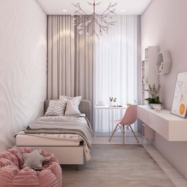
Moving into the kids room we do get to see something a bit more playful and colorful.
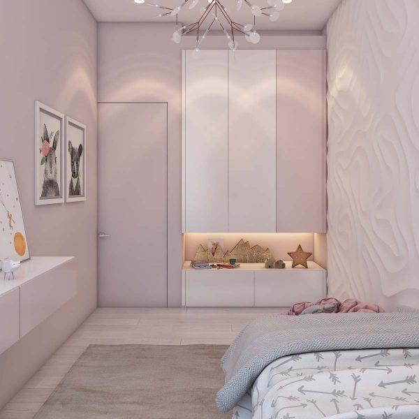
The lovely pink walls are still within the realm of neutral, but bring a bit more life to this youthful space.
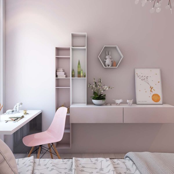
This lucky little girl even gets an Eames chair of her own for studying.
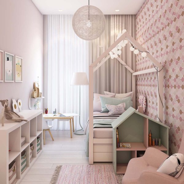
Most kids beds are a lot simpler than this pretty canopy frame, but this one will be much more memorable.
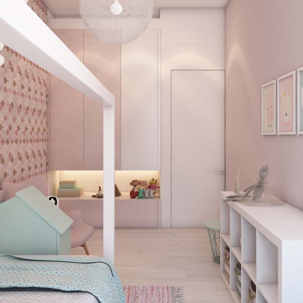
By not using the pink on every surface, the design becomes much more palatable and not so cloying.
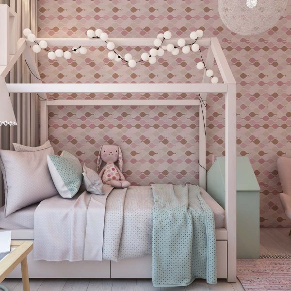
A patterned wallpaper adds another layer of interest.
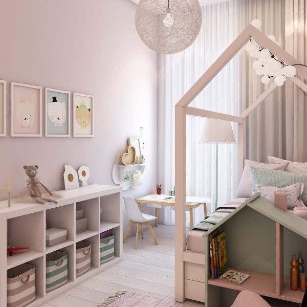
And no kids room is complete with storage and shelving.
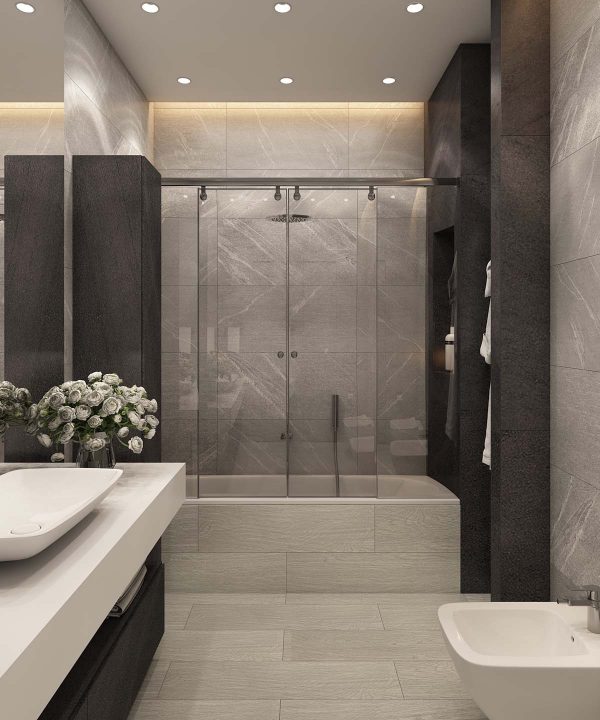
In the first bathroom we return to the full on neutral palette, this time even darker.
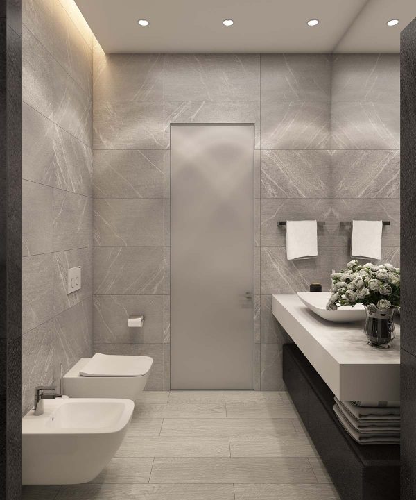
Recessed lighting is a practical, if not beautiful, solution to bathroom lighting.
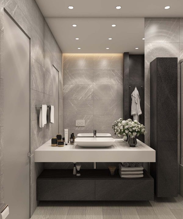
Smooth, shiny cabinetry contrasts with and reflects interesting wall textures.
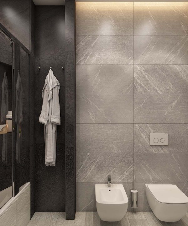
Black and gray are not very vibrant, but they are soothing in their own way.
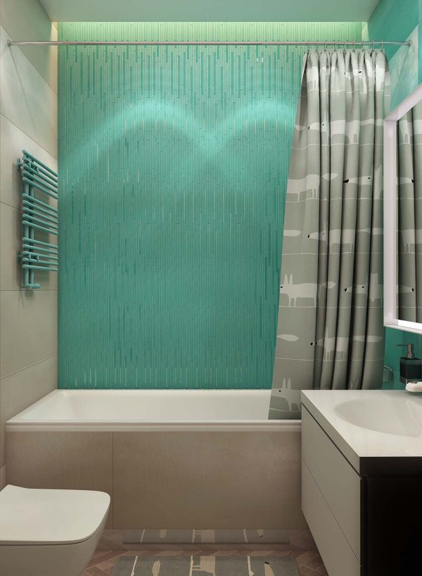
The second bathroom takes a bit more of a risk with some really vibrant shades of green.
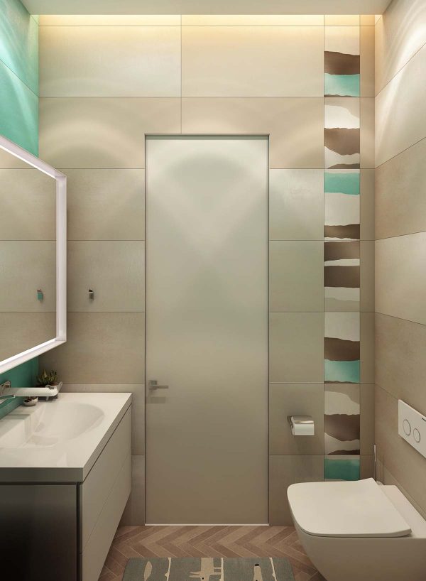
Green, brown, and beige work together to bring a bit of fun into this design.
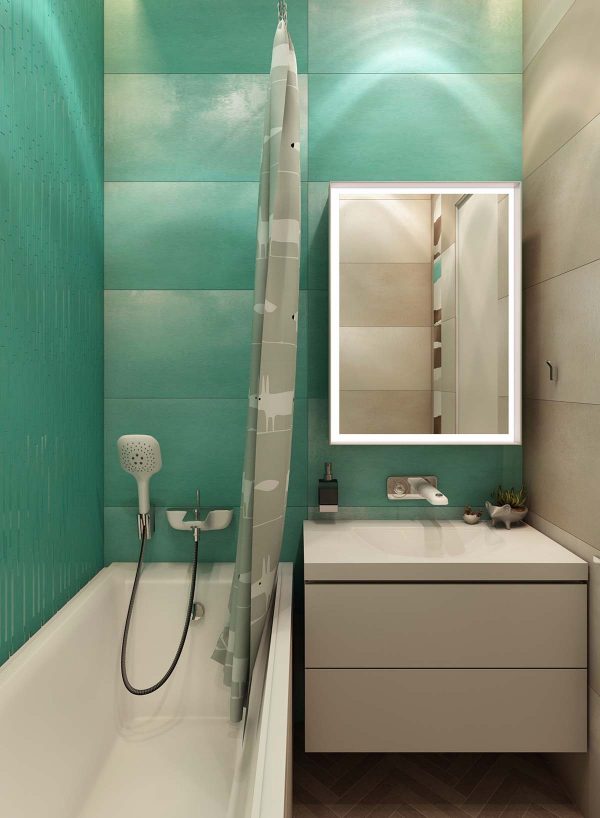
A lit mirror is highly flattering and great for selfies.
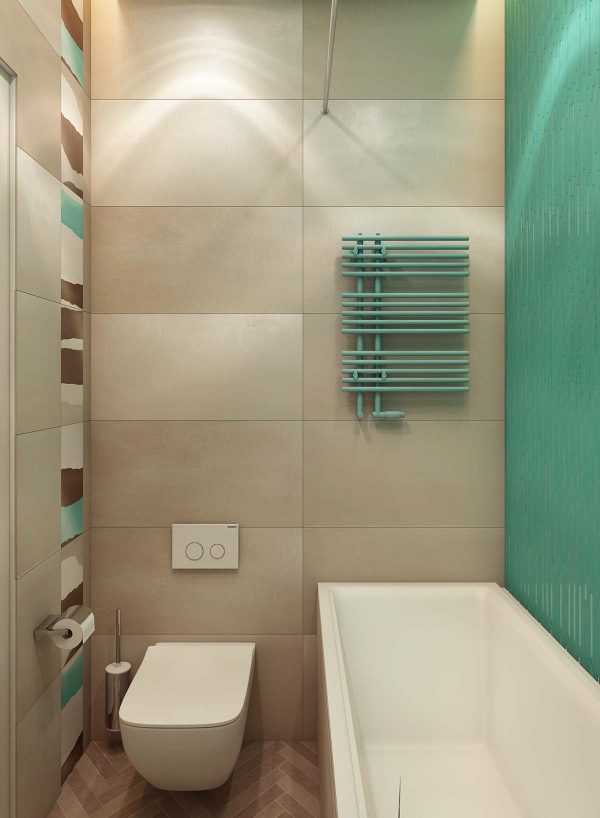
By adding just a bit of color, the room gets a whole dose of personality.
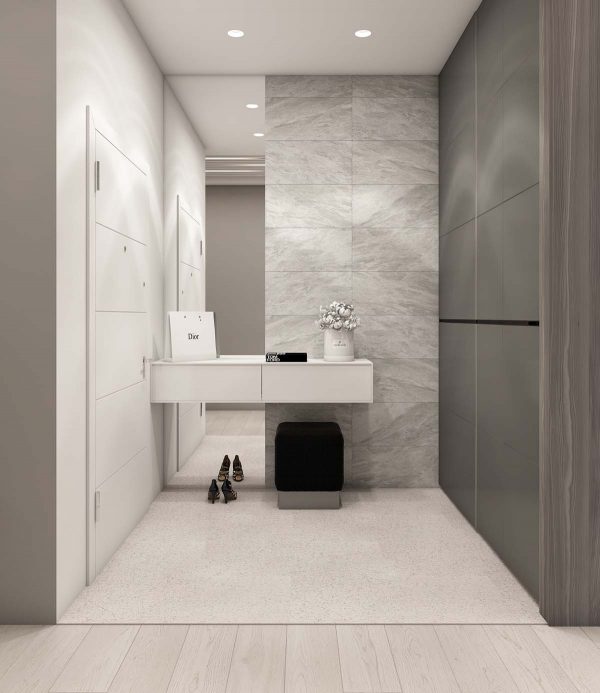
Different shades of gray create some degree of visual interest.
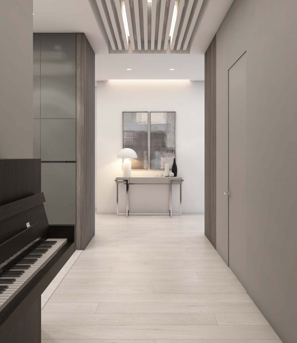
A simple console table under a mirror is a classic design choice.
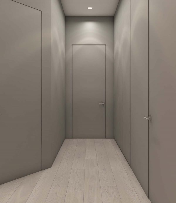
The gray walls and doors look a bit institutional in this view, but they are easy to match with more playful elements when an occupant chooses.
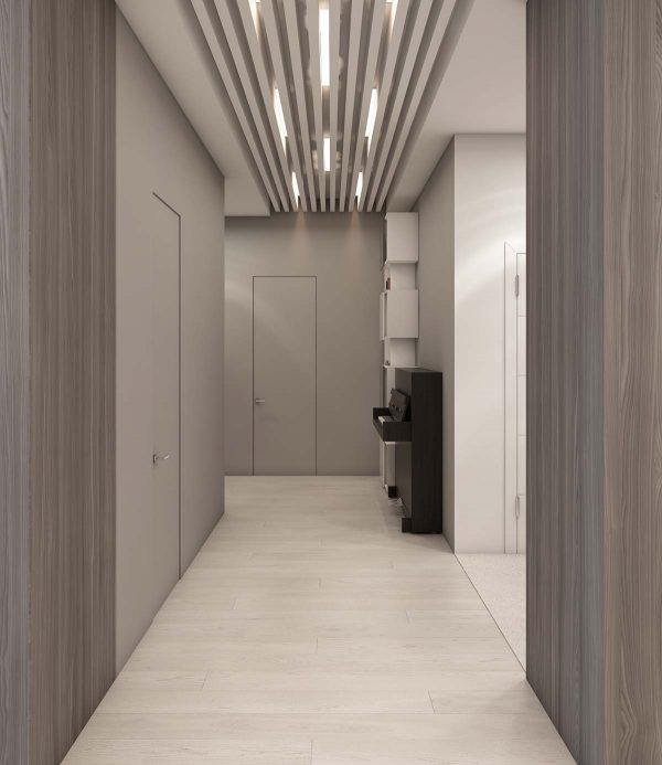
Creative overhead lighting ensures plenty of light to brighten up the neutral space.
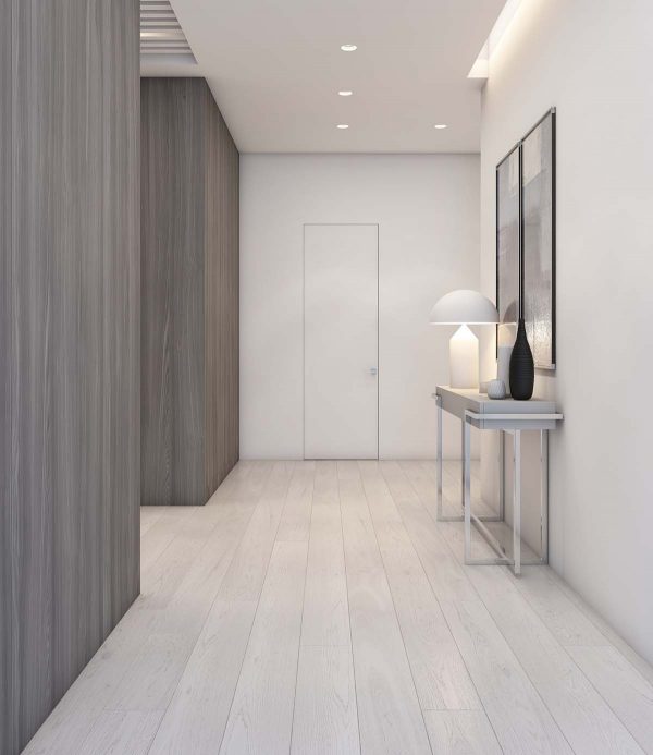
While you may not feel immediately at home in a space like this, it is easy to understand and certainly soothing in its own way.
Related Posts:


