How To Use Neutral Colors In Interior Design: 2 Examples That Show The…
Anyone with an interest in design knows that there are an infinite number of ways to decorate the same space. Whereas one family might prefer bright color, soft textures, and lots of indoor plants a young couple may tend towards minimalism and cool, neutral colors. The two homes featured in this post are both in the latter camp. By using largely neutral colors like gray, brown, white, and beige the designs cultivate serenity. There is nothing more soothing than moving from room to room and knowing that each space will be a cool, clean, simple space. Just look below to find out how relaxing these kinds of designs can be.
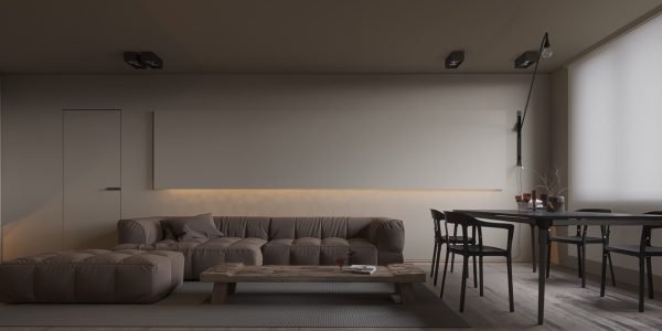
Visualizer: Igor Sirotov
The first home is a simple design that includes very few frills or unnecessary pieces.
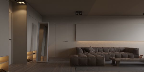
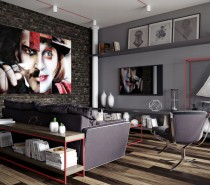
Beginning in the living room, the space is largely dominated by a soft but simple gray sectional sofa, set against ercu walls.
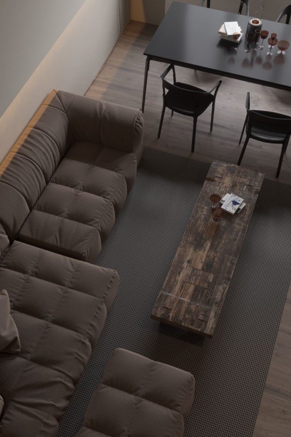
In a simple design, unique coffee tables like this reclaimed wood design can act as focal points.
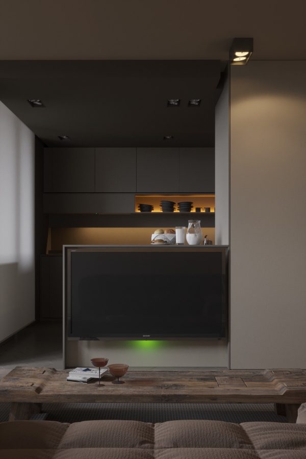
Mounting the television under the counter is a unique way to save space and keep those walls bare.
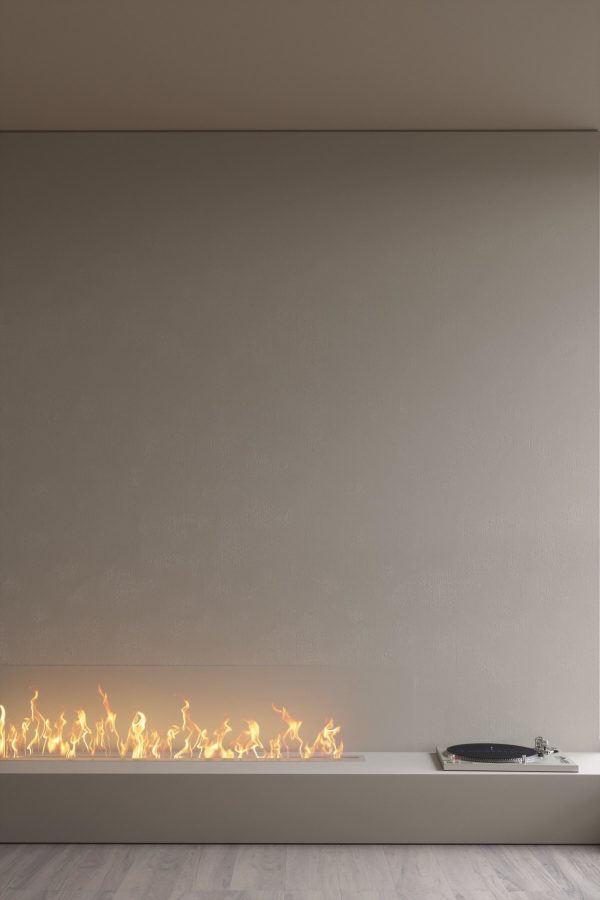
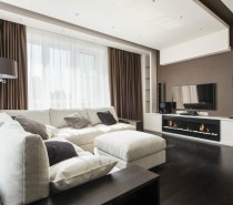
A creative fireplace provides a bit of warmth to the cool space, both figuratively and literally.
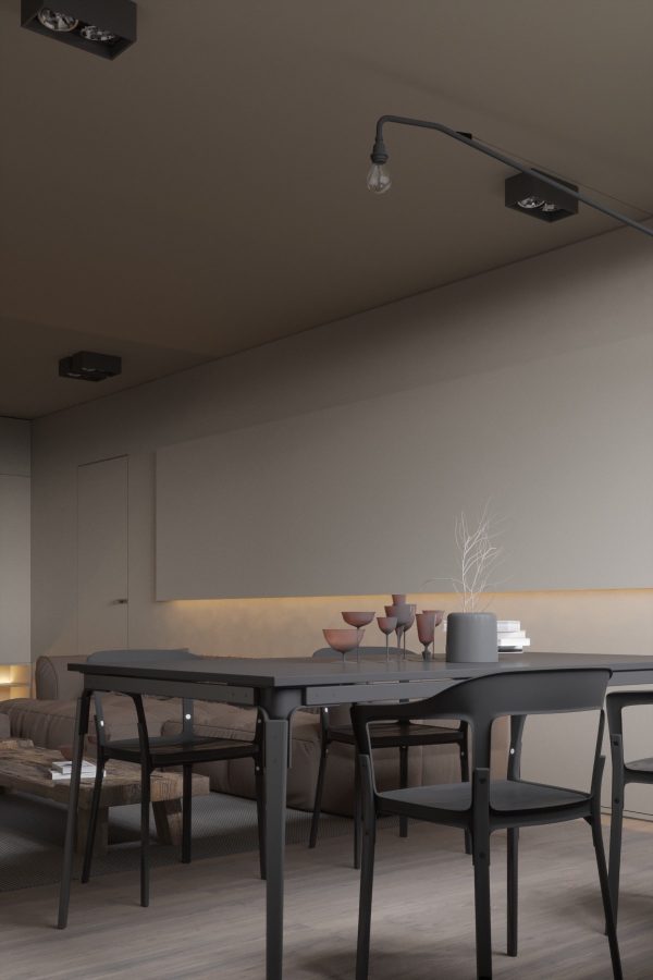
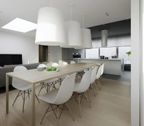
The open floor plan mean that unique wine glasses set on the table become a decorative choice.
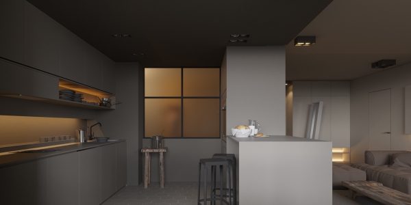
A frosted interior window lets a little bit of light into the dark grey kitchen.
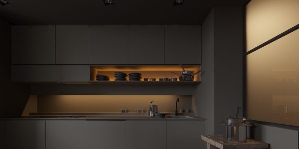
Grey kitchens offer a modern look that woks well with many types of kitchen appliances and accessories (whether or not you choose to use them).
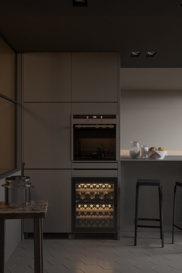
For instance, a simple glass pitcher in a gray kitchen takes on a life of its own.
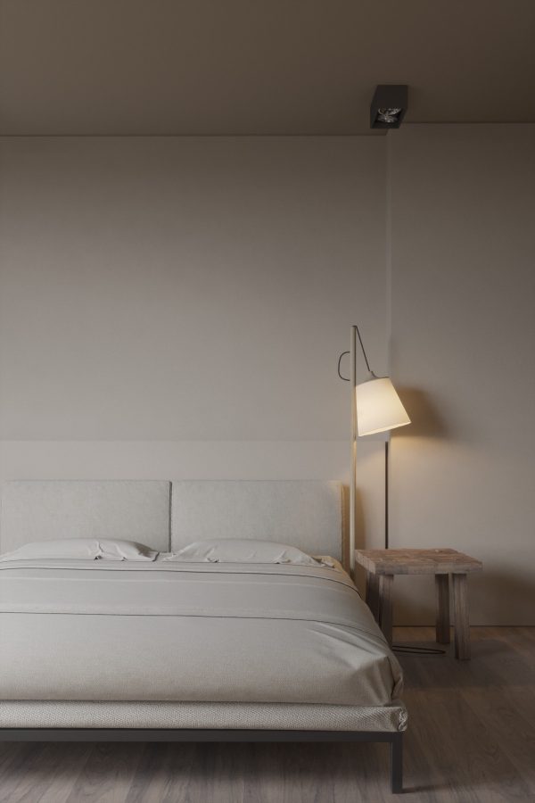
Moving into the bedroom, unique floor lamps offer a bit of character to a sparse design.
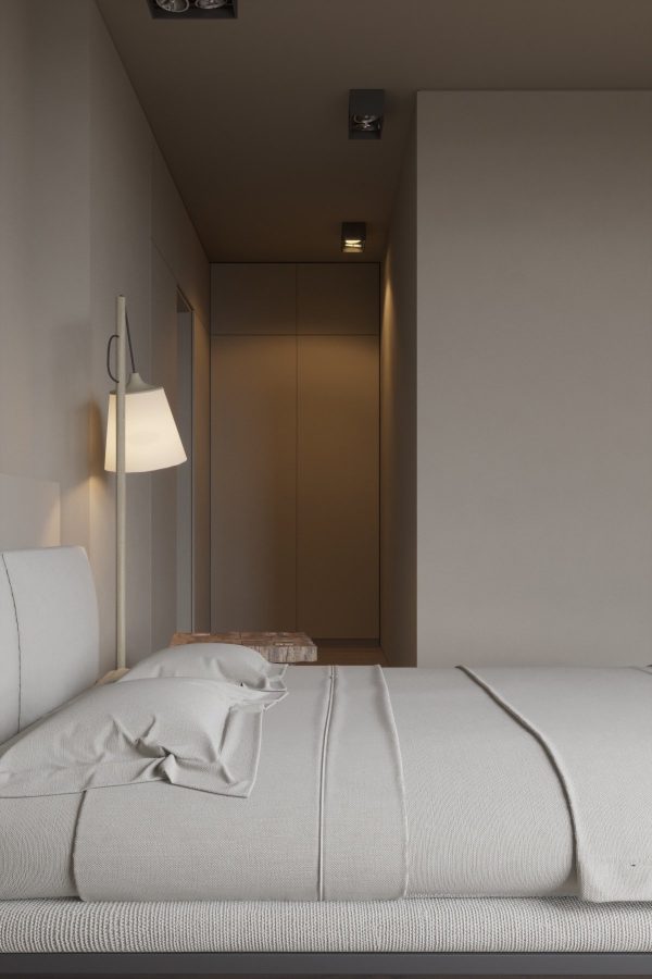
A white platform bed is a simple centerpiece and all but blends with the walls.
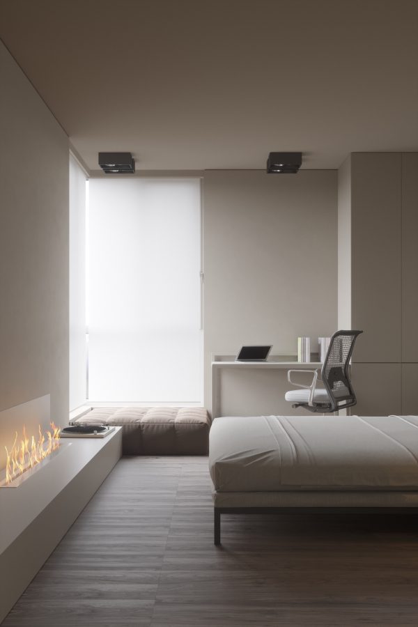
A small desk area continues the white theme — desk chair, desk, even mugs.
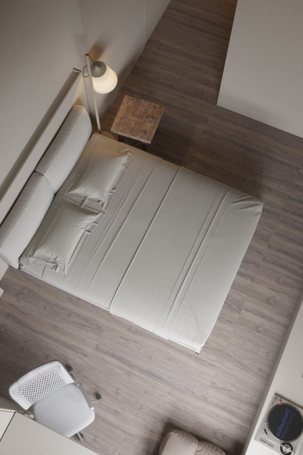
White and wood together, with a side table and the floor, are a match made in minimalist heaven.
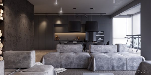
Visualizer: Kyde Architects
The second home is called “House on the hill” and is located in Cuxhaven, Germany.
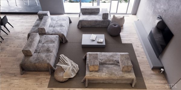
The team at Kyde Architects designed the house for a young man who is the director of an IT company.
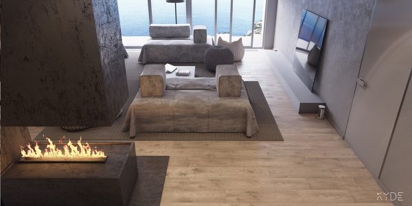
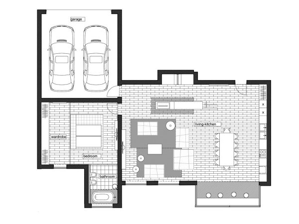
The 160 square meter (1722 square feet) home features a large gray modular sofa in the main living area.
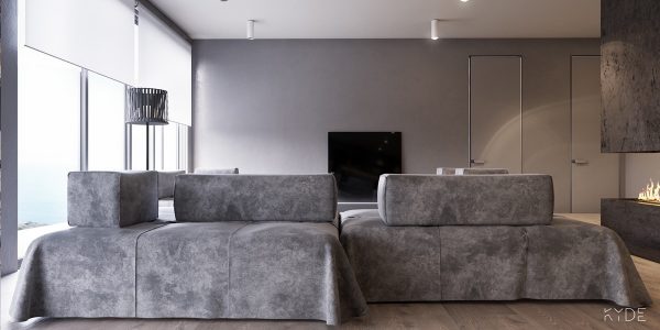
The sofa can easily be reconfigured to sit people in different arrangements, making it both stylish and practical.
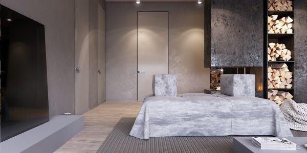
In addition to the sofa, the main open living area features a modern fireplace.
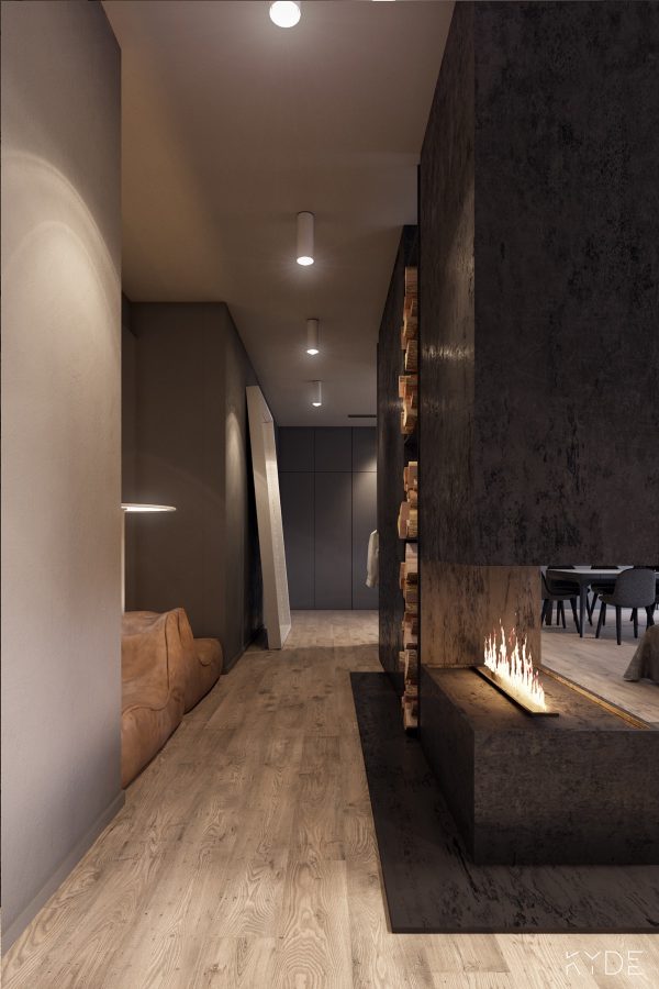
The inclusion of the fireplace also acts as a room divider for different spaces.
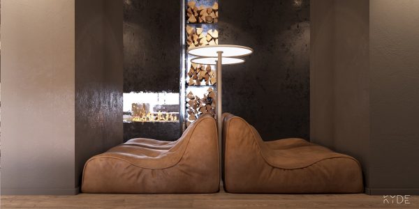
Molded leather seating offers another masculine, modern seating option.
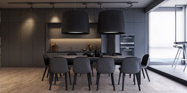
The gray and black dining room design includes dining room pendants as well as modern dining chairs.
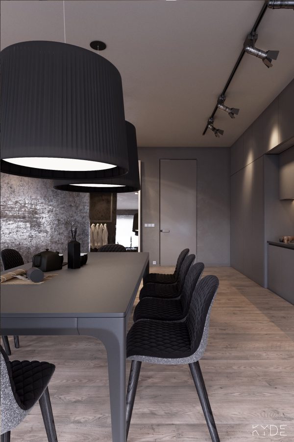
Carefully chosen accessories like unique teapots can make a big difference in a minimalist design.
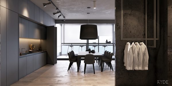
Lots of natural light is imperative if you are going to decorate with so many dark colors.
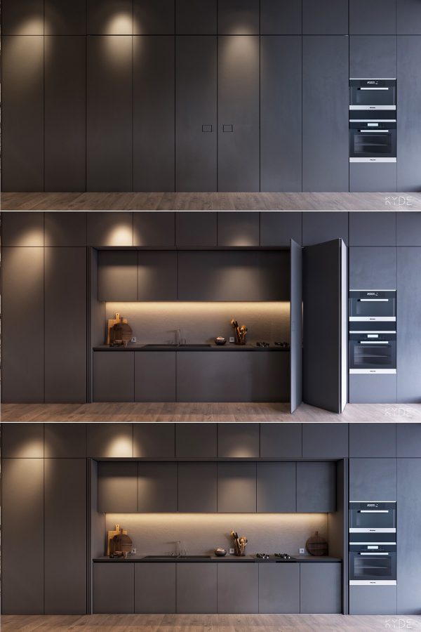
To take the clean lines to the next level, the kitchen features are largely hidden. Dark gray walls slide open to reveal the sink and countertop while the oven stays exposed. The result of this unique design is kitchen clutter than can be completely hidden from view whenever the homeowner likes.
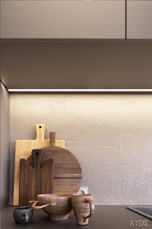
Even such beautiful kitchenwares as natural wood cutting boards can look messy when left out. But not in this kitchen.
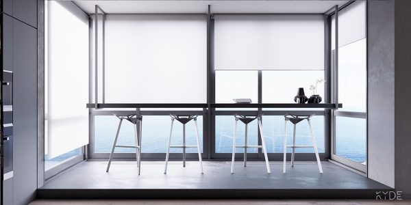
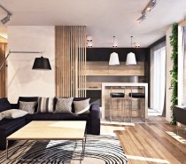
Kitchen bar stools are placed in an elevated nook for a beautiful dining experience.
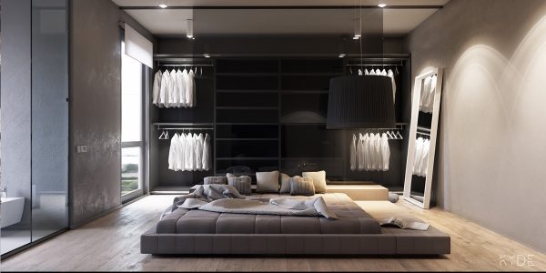
The bedroom does feel like it was built for a man with little warmth or unnecessary elements.
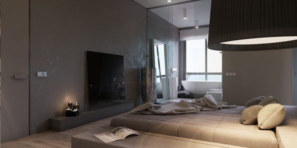
A low-to-the-ground bed with a spacious en suite and lots of gray does not exactly scream “cozy”.
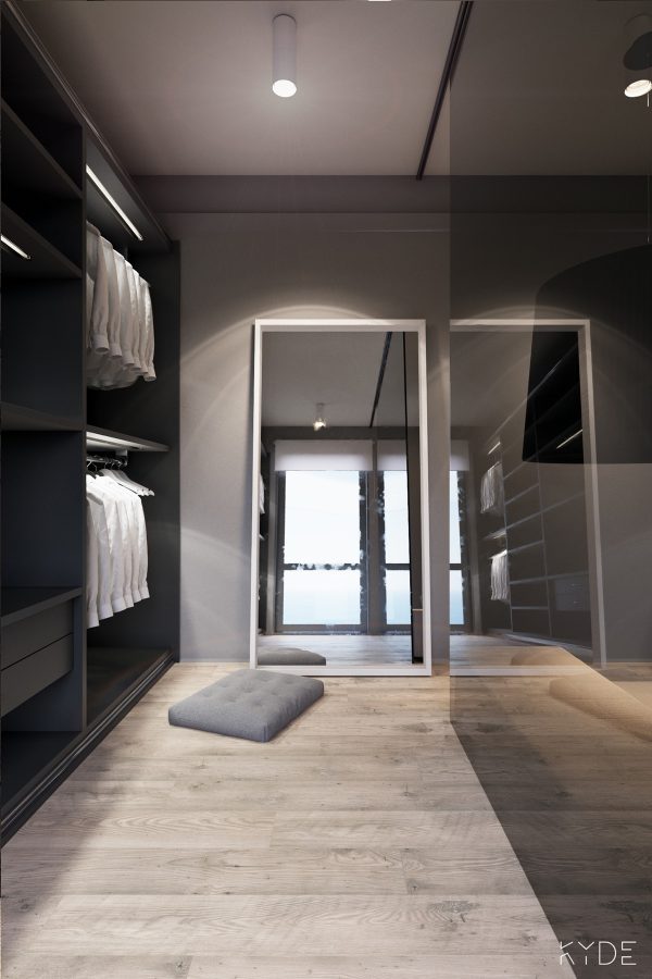
Lots of closet space is always a nice feature — here it must stay organized or it could quickly become a design disaster.
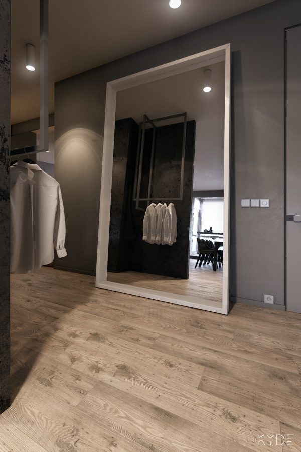
Large mirrors leaned up against the wall are an elegant solution that again keeps walls uncluttered.
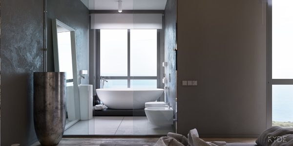
The spacious bathroom includes a tub with a view, which is the height of luxury.
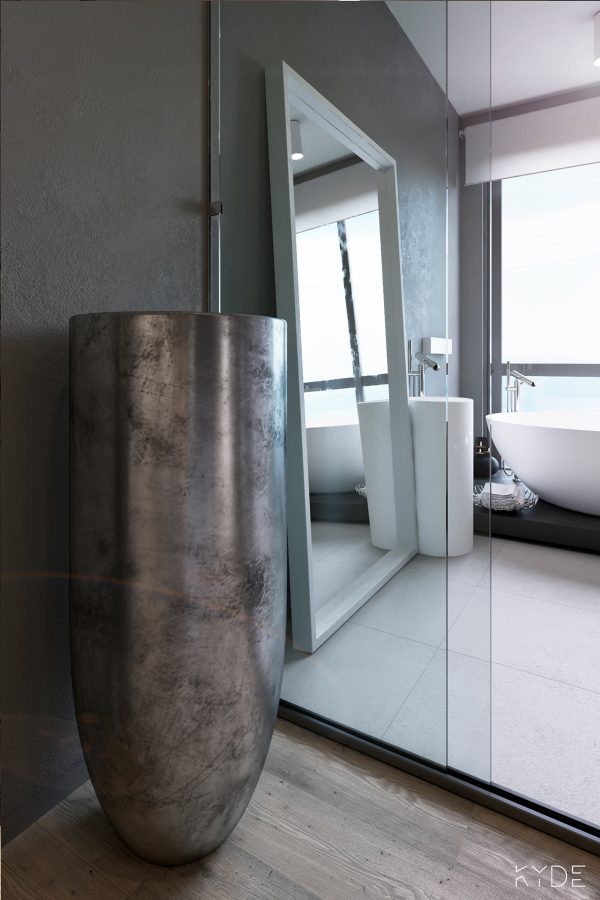
A burnished container adds a bit of sparkle to the largely matte design.
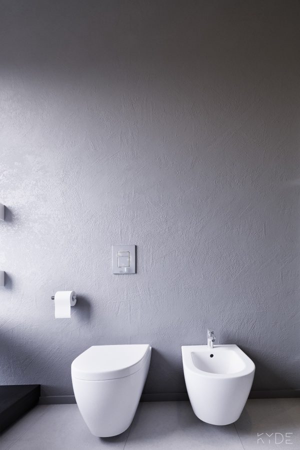
Cool gray walls in the bathroom are made a bit more interesting with texture.
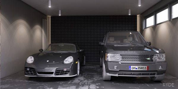
Even the garage has the sleek, modern, minimal feel.
Related Posts:


